
Article Method 8 min read
How to read a production-efficiency claim
Nine questions that decide whether a number means anything, written by working through the ones that weaken our own. Includes two of our reports on the same four months that do not reconcile.
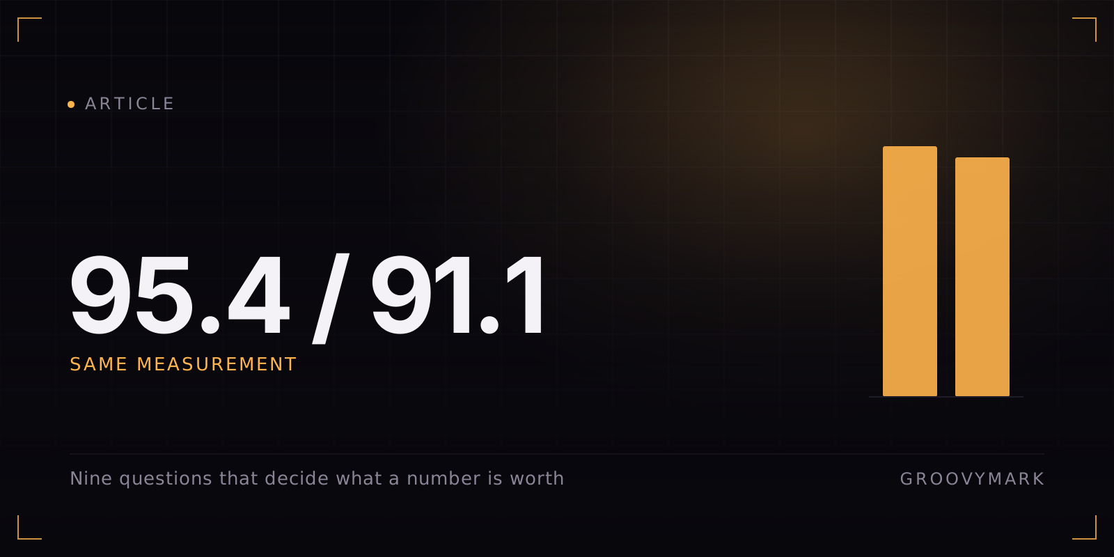
We have two reports covering the same four months of the same account. One says the energy reduction was 95.4%. The other says 91.1%. Neither is wrong and neither is a correction of the other. They were scoped differently — one excluded the operator from the human side and excluded the hand-made long videos and thumbnails from the automated side; the other counted all of them — and the difference between the two numbers is entirely the difference between those two decisions.
That is not a confession. It is the single most useful thing we can tell you about reading any figure in this market, including the ones on this site. Scope decides the number. Two honest people measuring the same operation will produce different results, and the gap between them is often larger than the gap between vendors.
Here are the nine questions that actually determine what a claim is worth. We wrote them by going through the ones that weaken our own review, because those are the ones we know are real.
1. Which figures are instrumented?
Ask for the split in writing: measured, counted, or estimated.
In our review, one figure is instrumented — measured 5.48 kWh drawn by the automation PC, read off its own counters. Output counts and cost records are counted: they exist as records, but nobody put a meter on them. Everything else is estimated.
A vendor who has not made this split has not thought about their own numbers. A vendor who claims everything is measured is worse.
2. Where did the baseline come from?
The “before” figure is where claims go wrong most often, because nobody audits a number that makes the vendor look bad.
Our 98.5% right-first-time figure comes from real approve and reject decisions on finished deliverables. The 60% it is measured against is an internal estimate. The whole accuracy-adjusted comparison therefore rests on the weaker of the two, and if that estimate is wrong the headline moves. That is a real weakness and it belongs in the same paragraph as the result.
3. Whose hours are in the denominator?
This is the most commonly and most quietly dropped question. If the denominator counts only the hours the vendor’s tool touched, the number describes the tool and not your operation.
Our July and August figures count the client’s own editor cutting 56 long videos a month by hand, on the automated side of the comparison. Excluding them would have been technically defensible and would have moved the headline from 41.6× to 74×.
4. Are the periods aligned with the work?
Costs land on the date they were recorded, not the date the work happened. In our case some August content was produced during July, so the recorded monthly totals were $2,074.63 and $1,232.37 — a difference that says almost nothing about either month. The review averages them at $1,653.50 each and says so, because splitting them by record date would have understated July and flattered August.
If a claim compares two months, ask whether anything was in flight across the boundary.
5. Is any period incomplete?
Our August figure carries an $80 allowance for spend expected before month end, because the month was still running when the figures were taken. It is a small number and disclosing it costs nothing. A partial period presented as a whole one is how a good month becomes a trend.
6. What is being counted as one unit?
Every piece in our review is weighted equally: a long video counts the same as a community post. That is crude, and we would not defend it as a measure of value.
It survives here only because the production ratio held steady across all four months — roughly one long video to 4.3 shorts and 4.3 post sets — so the months stay comparable to each other even though the absolute per-piece figure is a blunt instrument. If the mix had shifted, the comparison would be worthless, and the same is true of anyone else’s per-piece number.
7. Could anything be counted twice?
Two places in our own review where it could:
- Electricity is deliberately left out of the dollar figures. At commercial tariff, 136 kWh is roughly $16 a month and it already sits inside the office overhead line. Adding it as a separate saving would have counted it twice.
- A small block of API testing credit in July may already sit inside the tooling figures — a possible double count of about $30, disclosed rather than resolved, because we could not resolve it cleanly.
Neither materially changes the result. Both are the kind of thing that goes unmentioned in a claim written to persuade.
8. What does the environmental figure exclude?
Every carbon number is a boundary drawing exercise. Ours covers grid electricity only. It excludes commuting for nine people, office lighting and cooling, and the embodied carbon of nine devices against two — all of which would widen the gap in our favour and none of which we have claimed.
It also excludes the datacentre energy behind the API calls, which would narrow it. That figure is not published by the providers, so we left it out rather than guessing. A guess in our own favour would be worse than the gap it filled.
9. What is actually causing the improvement?
The honest reading of our own review is that most of the cost saving came from headcount, not tooling. The pipeline made a smaller team viable at higher volume. It did not, by itself, produce the saving.
That distinction matters commercially, because it tells you what you are buying. You are not buying a discount on your current operation. You are buying the ability to run a different one — and if you are not able or willing to change the shape of the team, the cost figure will not arrive.
Applying this to us
Run these nine at our numbers and you get a fair picture rather than a flattering one:
| Claim | Rests on | Strength |
|---|---|---|
| 41.6× faster per usable piece | Counted hours, counted output | Strong — volume rose 34% at the same time |
| 3.99× cheaper per usable piece | Cost records, estimated baseline accuracy | Range: 2.39× to 3.99× |
| +38.5 points right first time | Real decisions vs internal estimate | Half measured, half estimated |
| 91.1% less electricity | One metered device, researched draws | Scope-dependent — 95.4% under a narrower scope |
| 530 kg CO₂e avoided per year | Grid electricity only | Excludes datacentre energy, unquantified |
Two of those five we would put weight on. The other three we would use to describe a direction, not to sign a contract.
If that reads as underselling, consider the alternative. A number you cannot interrogate is not evidence, it is decoration — and you are going to find out which one you bought about four months in, on your own account, with your own money.
The complete dataset, including everything above, is in the production review.